Design and code responsive Skeleton Screens
You will learn how to design a Skeleton Screen thinking about its asynchrony and how to code it based on Sketch or Photoshop opacity modes.
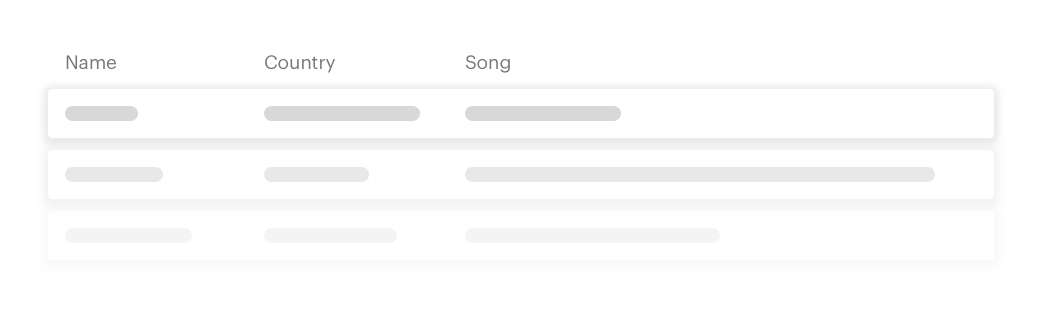
| Name | Country | Song |
|---|---|---|
What are Skeleton Screens?
Surely Facebook or Linkedin have been the main drivers of the so-called Skeleton Screens. You just have to log in in these platforms and you will see bars that move giving you the feeling that the content is loading.
The Skeleton Screens are used to show instant content before having the final content that it's loaded asynchronously. Asynchronously? What the hell is that? Asynchronous content is all the content that we have to "wait" for it to load with a temporary delay. The majority of cases is content that comes from a request to a server (through the famous APIs) and we expect from the frontend to receive it but we just don't know when and it shouldn't prevent the rest of the page from being displayed. I will write more about it in another post, for now it's important to simply know that the asynchronous content is the one that is not loaded instantaneously, but we have to wait to get it.
Why are the Skeleton Screens for the UX important?
The Skeleton Screen are very important because they serve to communicate to the user who will receive a content soon. The user don't need to know that we are making a request to an API that takes 2 seconds to return the information, he/she simply needs to know that the page hasn't finished loading and the information will be displayed soon. They are very similar to the loaders, they only differ in that they look like the final content so that the user knows what he/she is going to receive (context).
In this post you will see how to design and implement a Skeleton Screen for a concrete and complex example: a datagrid. It's a real example that I made for a Holaluz's project but this time I've changed its CSS to match the style of my website and its content to music instead, much more interesting than electric contracts ;)
Design a Skeleton Screen
Step 1: Distinguish the asynchronous content
To start the design you need to know which content will be asynchronous and which content won't be, so it will be synchronous. If you just take care of the design part or you just landed on the project, you'll have to ask your frontend colleagues what content the API is sending and most importantly: what content you already know you're going to show anyways.
In this case, I as an UX Engineer in this project (work in design and development), I already had this information and could distinguish between:
- Synchronous content: the structure of the table with its titles, which has 3 columns and I knew their height.
- Asynchronous content: the content of each row that the API will return as an object. Each row is divided into 3 columns.
This is the graphic scheme I needed to know before taking any design tool:

The purple rectangles represent the synchronous content and the green rectangles represent the asynchronous.
Step 2: Design the skeleton screen with flat elements to supply and represent the asynchronous content.
And here the complication comes: I didn't know how many columns of asynchronous content the API was going to return or the length of its content and there is no way of knowing it because it's always different depending on the user or applied filters. I had to create a design that works for all its possible options, either return a row or 50 rows of content when the API request ends.
To solve this, there are visual resources that we can use, in this case I chose to capture 3 rows with different opacities merging into the final background and 3 columns in each row with random widths. In this way the user get the visual feeling that there is an undefined row lenght. And each row has an undefined width for each column.
Loaders and the skeleton screens are characteristic for their animations since it makes our brain think that things are happening and something is going on.
In this case I applied two animations, a vertical one that showed one row after another and also remove them once the 3 of them are loaded and the most famous, characteristic and difficult to do: an animation from left to right where a vertical line runs through the content. Something like this:

I don't usually design small animations, because I directly code them in CSS to increase speed and to be realistic with the type of animation I can do. What I usually do is to find resources and have the idea in my head that I will develop later in CSS. I understand that many designers work on detailed animations but in my case as an UX Engineer, where I can apply them directly into the code, it's easier, more realistic and faster in this way. In any case, if you have to develop complex animations, transitions or flows, I recommend you always design them beforehand. Always use the tool you feel to need at the right time.
How to code a Skeleton Screen thanks to the opacity modes of Sketch or Photoshop
Let's suppose that you already have coded the table layout and it's this one:
| Name | Country | Song |
|---|---|---|
| Florence + The Machine | England | What Kind of Man |
| IZAL | Spain | La Increíble Historia del Hombre Que Podía Volar Pero No Sabía Cómo |
| James Bay | England | Us |
| Lana Del Rey | United States | Ride |
| London Grammar | England | Wasting My Young Years |
| Tom Odell | England | Another Love |
Step 1: Code the 3 rows with its fake content.
Make a tbody alternative to the real table that will change if the boolean isLoading is true. Within this tbody we will generate 3 rows where each one has the number of columns that we already know and each column has a div of a random width. I did it with Vue.js but you can do it with any other framework, it's just modifying the template according to a boolean variable that can be changed.
<tbody v-if="isLoading">
  <tr
    v-for="index in 3"
    :key="index"
    class="datagrid__row"
  >
    <td
      v-for="column in columns"
      :key="column.title"
    >
      <span>
        <div
          class="datagrid__loader"
          :style="`width: ${Math.floor(Math.random() * 51) + 50}%;`"
        />
      </span>
    </td>
  </tr>
</tbody>
Result:
| Name | Country | Song |
|---|---|---|
Step 2: Create the vertical animation
This animation will show one row after another and it will also remove them once the 3 of them are loaded. First, we define it and then we apply it to datagrid__row. In rows 2 and 3 we will put a delay to obtain the desired effect: one row after another.
@keyframes aniVertical {
  0% {
    opacity: 0;
  }

  50% {
    opacity: 1;
  }

  100% {
    opacity: 0;
  }
}

.datagrid__row {
  animation: aniVertical 3s ease;
  animation-iteration-count: infinite;
  animation-fill-mode: forwards;
  opacity: 0;

  &:nth-child(2) {
    animation-delay: .5s;
  }

  &:nth-child(3) {
    animation-delay: 1s;
  }
}
| Name | Country | Song |
|---|---|---|
Step 3: The most complex part of a Skeleton Screen: horizontal animation.
This second animation is quite tricky. We have to create an animation from left to right that makes the "load" effect, it's kind of like a bar that runs through the content and without a doubt the most characteristic animation of a Skeleton Screen. But we find that it's very "difficult". The reason is that this animation has to go through different content divs. And it's even more complicated in a table since the structure of the HTML is more complex.
I'm going to show you the easiest option that I found to solve this problem.
It's based on some properties that we've seen in Photoshop or Sketch applied to CSS. The users of these programs know the layer opacity properties and blending modes. Do you recognize them?
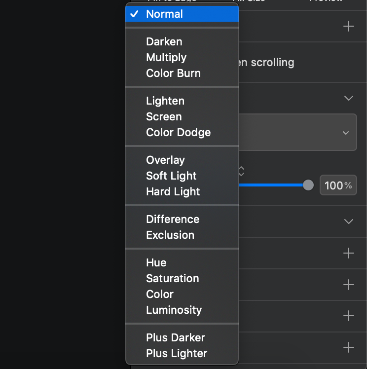
One of the blending modes is called overlay, which makes the dark colors of the layer to which we apply it only to be reflected in other dark colors of layers that are below but not to white layers.
It turns out that we have these same properties available in CSS through mix-blend-mode. This is great for solving the problem of having different content divs where the animation has to go through.
We will apply an :before to datagrid__row with an absolute position so it will cover the whole row and then we will create an animation, aniHorizontal, to run through the content.
@keyframes aniHorizontal {
  0% {
    background-position: -100% 0;
  }

  100% {
    background-position: 100% 0;
  }
}

.datagrid__row {
  position: relative;
}

.datagrid__row:before {
  content: "";
  position: absolute;
  width: 100%;
  height: 100%;
  animation-name: aniHorizontal;
  animation-duration: 3.5s;
  animation-timing-function: linear;
  animation-iteration-count: infinite;
  background: linear-gradient(
    to right,
    #cccccc 2%,
    #666666 18%,
    #cccccc 33%
  );
  background-size: 50%;
}
Result:
| Name | Country | Song |
|---|---|---|
Finally we apply the mix-blend-mode: overlay and magically we will get the vertical and horizontal animations together.
.datagrid__row:before {
  mix-blend-mode: overlay;
}
Result:
| Name | Country | Song |
|---|---|---|
Play with the final result
All these examples that you've seen before are not images or videos, they are an unique component of Vue that I changed in each case modifying its props.
Now you can play with this component variation by clicking the checkbox of loading that will change the status from normal to loading state.
| Name | Country | Song |
|---|---|---|
| Florence + The Machine | England | What Kind of Man |
| IZAL | Spain | La Increíble Historia del Hombre Que Podía Volar Pero No Sabía Cómo |
| James Bay | England | Us |
| Lana Del Rey | United States | Ride |
| London Grammar | England | Wasting My Young Years |
| Tom Odell | England | Another Love |
In a real application, isLoading variable will be given by the system which implements the asynchronous load and it'll be a boolean type too, like this checkbox.
Things to keep in mind about blend-mode
Mix-blend-mode: overlayCSS property only works if the rows' backgrounds are totally white or totally black (the vast majority of the cases).Mix-blend-modefor now it's not available for IE or Edge. But this will change within a certain time, says Microsoft. You can see its support in different browsers here.
If you want to create a Skeleton Screen on a background that is not black or white, or you have to give support to IE or Edge, I suggest you this other solution that uses SVG. It's much more complex, I'm not sure you can do it between different divs and it requires you to use an external package but it's the best alternative I could find.
If you liked this tutorial or the songs in the playlist, you can follow me on Twitter and continue the conversation over there. All feedback is welcome! If you think there is something that can be improved, you would help me a lot.
The web design and development content that I'd like to receive
Subscribe to my newsletter to get notified every time I write a new article about design, development or personal projects. They will not be regular and I'll always try to give you the highest possible quality.
If you prefer you can follow me on Twitter.